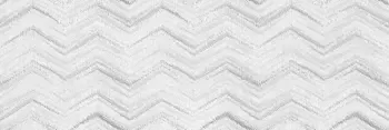
353 Products
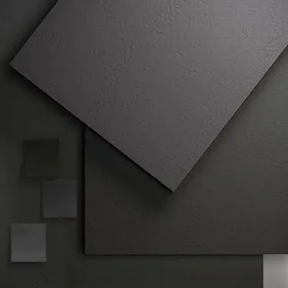
125 Products

20 Products
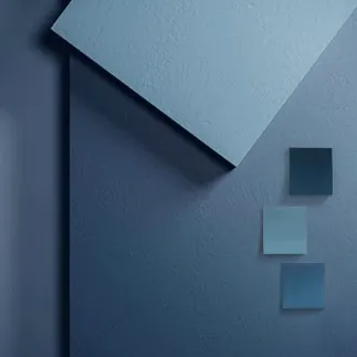
107 Products
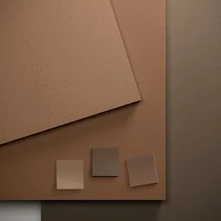
147 Products
100 Products
260 Products
93 Products
92 Products
27 Products
3 Products
12 Products
560 Products


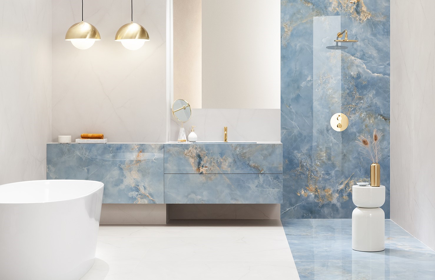
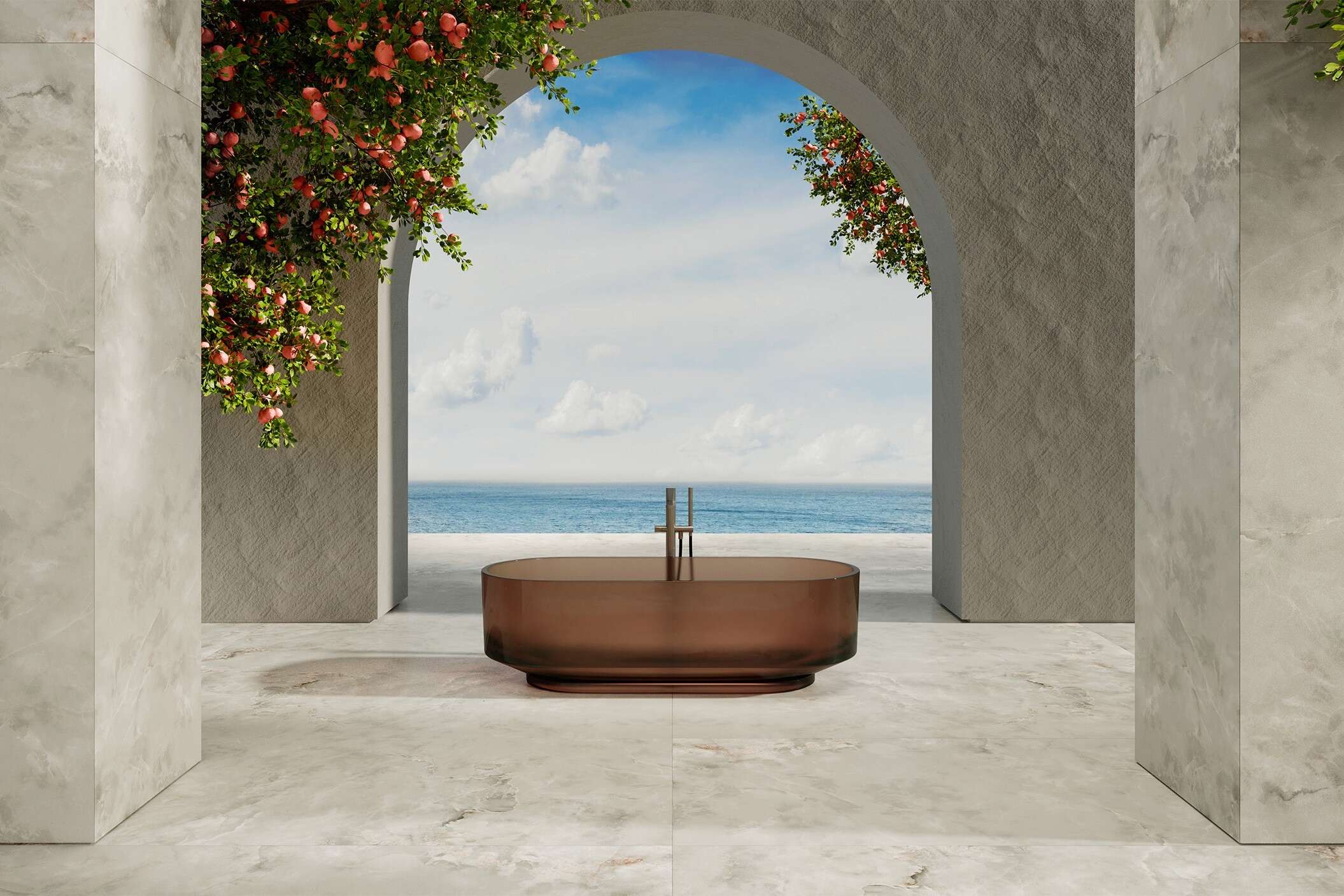
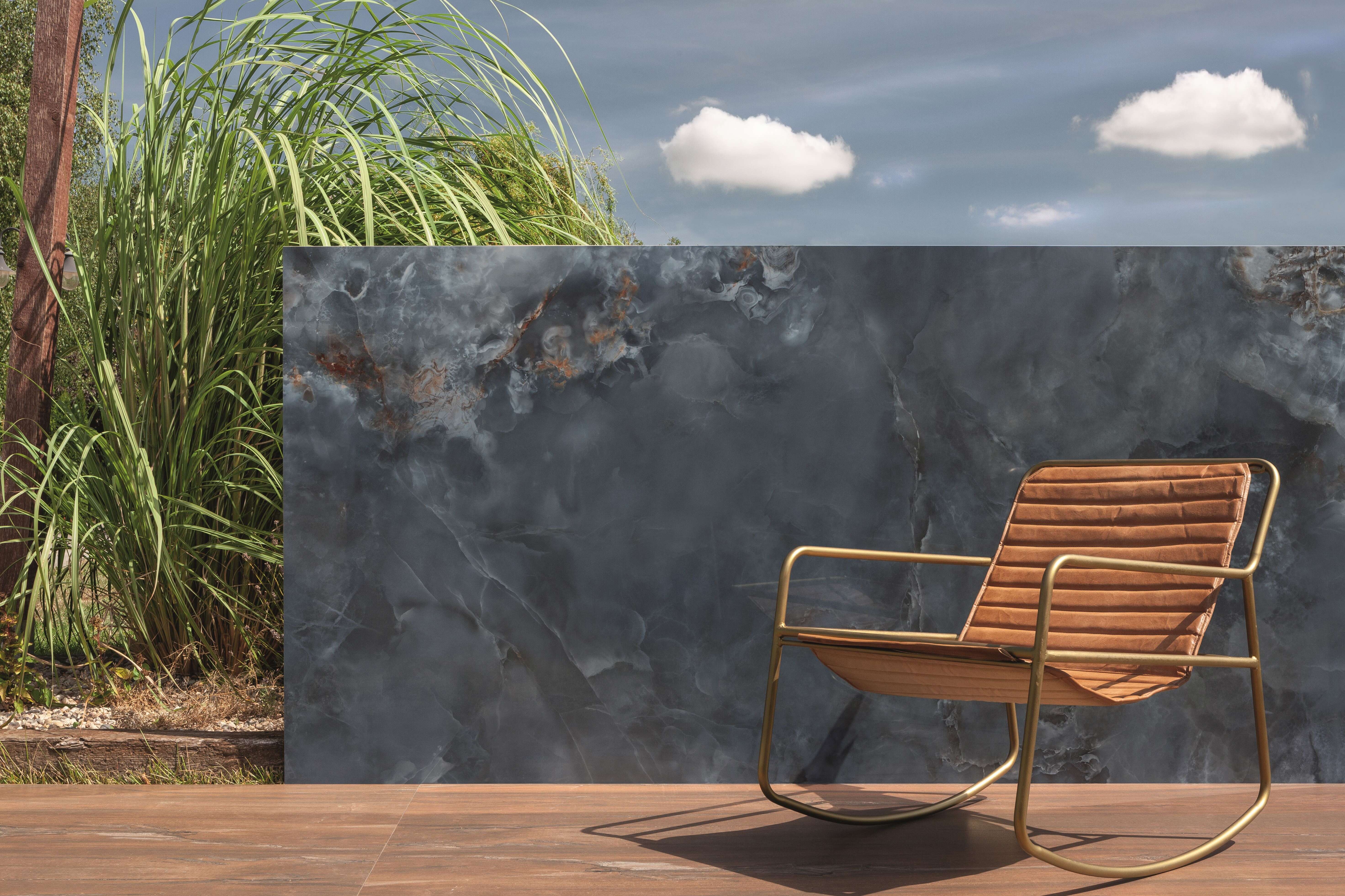
Color is usually the first thing decided and the hardest to judge from a screen. The same tile reads warmer under a bathroom bulb than under showroom lighting, and a white with a gray undertone will fight a white with a cream one. Every page below groups porcelain and ceramic across floor and wall formats, so you can see the full range of a color before committing.
Light does most of the work. A small windowless bathroom takes light-reflecting glossy faces well, which is why white and light beige dominate wall tile. Darker tones — black, navy, graphite — hold up better on floors than on the walls of a small room, and they show water spotting and dust more than a mid-tone does. Structured and matte faces read a shade deeper than a polished version of the same color, so a matte gray and a polished gray from one range will not match on a wall.
Grout changes the finished surface more than most people expect, because it can occupy a tenth of the visible area. A grout matched to the tile makes a floor read as one continuous surface; a contrasting grout turns the same tile into a grid. In wet areas a mid-tone grout hides the marks a bright white joint shows within weeks.
Order $1 samples and look at them in the actual room, at the time of day you use it most. If you would rather start from the material or the pattern than the color, the effect and shape and pattern ranges cover stone, wood, concrete and marble looks alongside hexagon, subway and mosaic formats.